BFH Styles
This page describes the custom BFH styles, layouts, roles, and helper components provided by the documentation template. These additions build upon the standard Sphinx and sphinx-immaterial functionality and are intended to simplify the creation of consistent documentation.
BFH Admonitions
All admonitions described in the Immaterial Admonitions Reference page can be used.
In this template, additional admonitions are defined in the conf.py file.
Demo
.. demo::
Solution
.. solution::
Outcomes
.. outcomes::
Objectives
.. objectives::
Exercise
.. exercise::
Optional exercise
.. exercise:: Optional exercise
   :class: optional
Discussion
.. discussion::
The additional admonitions are defined in the conf.py file.
You can add your own custom admonitions with the help of Immaterial Custom Admonition.
BFH Tables
Tables are styled using the styles/bfh-tables.css file to match the BFH design guidelines.
Example:
Header 1 |
Header 2 |
Header 3 |
|---|---|---|
11 |
12 |
13 |
21 |
22 |
23 |
Table rst code
.. list-table:: BFH Table example
   :header-rows: 1
   :name: tab:bfhExample
   :align: center

   *  - Header 1
      - Header 2
      - Header 3
   *  - 11
      - 12
      - 13
   *  - 21
      - 22
      - 23
Two Columns
The template provides a simple two-column layout that can be used to place content side by side.
The layout is defined in styles/twocol.css and can be customized to fit project-specific requirements.
Left side
Right side
Two column code
.. container:: twocol

   .. container:: leftside

      Left side

   .. container:: rightside

      Right side
Lists
The stylesheet styles/lists.css extends the default Sphinx list formatting and supports automatic numbering using:
Numeric lists
Lower-case alphabetic lists
Upper-case alphabetic lists
The list style is automatically determined from the first list item specified by the user.
Upper alpha list starting with B
Next element
Next element
Nested first element starting with z
Next nested element
End of alpha list
Numeric list starting with 5
Next element
By default, nested ordered lists are displayed using lower-case alphabetic numbering.
Default numeric list
Next numeric list
Default nested element
Default next nested element
List code
B. Upper alpha list starting with B
#. Next element
#. Next element

   z. Nested first element starting with z

   #. Next nested element

#. End of alpha list

5. Numerical list starting with 5
#. Next element

By default, nested ordered lists are displayed using lower-case alphabetic numbering.

#. Default numeric list
#. Next numeric list

   #. Default nested element
   #. Default next nested element
Figures
It is recommended to use the figure directive when adding images.
The image can be referenced, captioned, resized, and opened in its original size by clicking on it.
Info
The file styles/figureHacks.css contains workarounds for image alignment and scaling issues in the Immaterial theme.

Example svg image
SVG image example
.. figure:: /_static/images/example.svg
   :alt: Example svg
   :name: fig-exampleSVG
   :class: center
   :width: 60.0%

   Example svg image

Example png image
PNG image example
.. figure:: /_static/images/example.png
   :alt: Example png
   :name: fig-examplePNG
   :class: center
   :width: 60.0%

   Example png image
BFH Colors
All BFH colors are defined in the styles/bfh.css.
To color parts of a text, the roles defined in .roles.def can be used.
The following list of roles is defined in this file:
bfhred
bfhyellow
bfhblue
bfhgreen
bfhgray
bfhpurple
bfhocher
Colors code
- :bfhred:`bfhred`
- :bfhyellow:`bfhyellow`
- :bfhblue:`bfhblue`
- :bfhgreen:`bfhgreen`
- :bfhgray:`bfhgray`
- :bfhpurple:`bfhpurple`
- :bfhocher:`bfhocher`
Listings
Source code can be included in three different ways:
literalincludefor external filescode-blockfor inline code snippetscustom roles for short inline code fragments
This code is added from the file _static/listings/externCodeSnippet.c with the command literalinclude.
For more information see also literalinclude manual.
void printHello(void) {
  puts("Hello World");
}
Literal include code
.. literalinclude:: /_static/listings/externCodeSnippet.c
   :language: c
   :start-after: PRINT_HELLO_START
   :end-before: PRINT_HELLO_END
With the code-block statement, code snippets can be directly added in the source text file.
Have a look in the code-block manual for more information.
int main(void) {
  printHello();
  return 0;
}
code-block code
.. code-block:: c

   int main(void) {
     printHello();
     return 0;
   }
The defined role :c: in .roles.def can be used to write inline c code sentences, e.g. #include <stdio.h>.
role code
:c:`include <stdio.h>`
Theme-Aware Logo
The template supports automatic switching between light and dark themes.
To ensure that the logo adapts correctly to both themes, it should be stored as an SVG file in the source/_templates/.icons directory and referenced using the page_logo variable in conf.py.
The template provides CSS variables that automatically adapt to the active theme and can be used within SVG graphics.
The following CSS variables automatically adapt to the currently selected theme:
var(--md-primary-fg-color) /* for font color */
var(--md-primary-bg-color) /* for background color */
To use these variables inside an SVG file, follow these steps in inkscape:
Select the desired shape
Open
Selectors and CSSor press Ctrl+Shift+QChange the or add the
fillelement with the desired color variable.Example
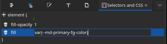
Example inkscape Selectors and CSS window
The shape will then be black because inkscape does not recognise the color.
Test your changes by rebuilding the web-page.
PDF Page Metadata
The PDF generation extension supports page-specific metadata through document headers. These metadata fields are evaluated during PDF generation and control the generated PDF filename, title page content, document type, and revision information.
Options:
pdf-build- Enables or disables PDF generation for the current page.pdf-filename- Defines the output filename of the generated PDF. Default is the pdf-title.pdf-title- Main title displayed on the PDF cover page amd in the left headerpdf-subtitle- Optional subtitle(s) shown below the title. Multiple subtitles can be separated using|.pdf-type- Document type used on the cover page (e.g.exerciseor custom types).pdf-revision- Version number displayed on the generated PDF.
Example from this document:
Example PDF Metadata Options
:pdf-build: True
:pdf-filename: pdf-extension-example
:pdf-title: PDF File Title
:pdf-subtitle: PDF Subtitle 1 | PDF Subtitle 2
:pdf-type: exercise
:pdf-revision: 0.0.1
Results in file header:
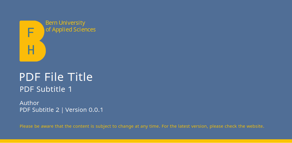
Example BFH PDF Title
The metadata are defined at the beginning of a source file and are only evaluated when the PDF generation process is executed.
Pages with :pdf-build: False are ignored by the PDF generator.